


Brand story
Mame-Mame is a Japanese snack made from soybeans, boiled in water or steamed right in the pods. It is a tasty and healthy product that can be an ideal alternative to popcorn or famous snacks.
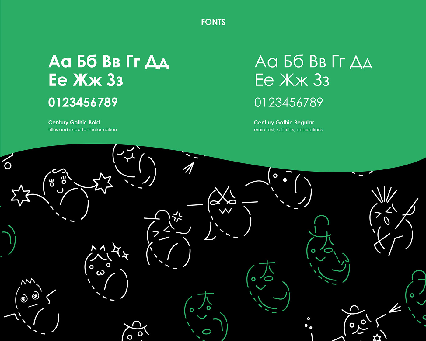
It was important to show the involvement in Japanese culture, as well as naturalness and health benefits of this product during the development of the brand corporate identity. That is why the corporate identity consists of green color and elements of Japanese characters and anime emoticons.
Mame-Mame logotype is a mix of Japanese hieroglyphs, emoticons and anime characters. Green color highlights healthiness as a soybean at the center of the logo.
Mame-mame beans were born from the elements of the alphabet and speak their language to you. Not only can you enjoy a healthy snack, but also decipher their messages!


Mame-Mame brand identity
Idea and graphic design: Ekaterina Lebedeva
Realization: Buro All Design


